The Dynamic Flow specification sent from the server to the client is made of two main parts:
- schemas that describe the data structure that you want returned from the client and
- layouts that tell us how you want different components laid out on the page
To appear on the page, a schema must be referenced by a form layout. Other read only layout components such as paragraph or alert can be inserted directly into the layout array.
The clients convert the schema into a tree of domain components which are ultimately mapped to views. For example:

The dynamic flow team maintains a standard set of renderers capable of rendering all core data and layout types inside the library. These make use of standard design system components and patterns, and you can see examples of these on the features page.
A “custom renderer” is what we call any renderer outside of our core set of maintained renderers. Consumers can provide these per-integration, to customise their flows.
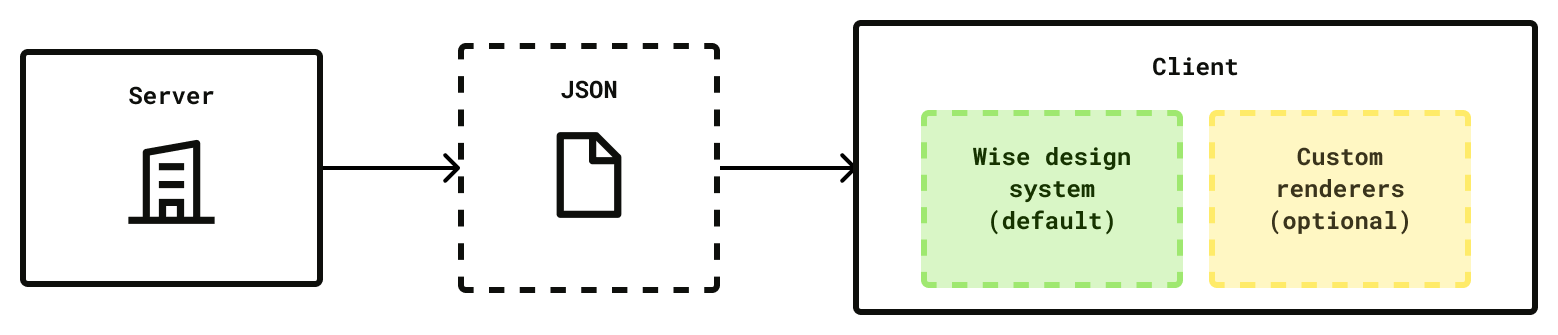
You can customise the look and feel of DF by swapping out one or more of our core renderers for a custom renderer of your own.
Your custom renderer will be passed a specific set of properties (that we call view bindings), with which you’re free to do anything you like. You cannot pass arbitrary data from the backend to your custom renderer - you will get the same view bindings that our own renderers receive. We do this so that we can fallback gracefully to our core renderers, should a custom renderer be unavailable (e.g. if the client is using an older version where the custom renderer is missing).
Note that in the example below, we expose data from the schema via view bindings to the renderers. The custom renderer can style the content however it chooses, but it only has access to the data passed from the view binding.


Our clients map the spec into a tree of domain layer components. To render these, we:
- First, add any custom renderers to our list of default renderers
- Map our components to view bindings
- For each component
- Pass the view bindings to each renderer in turn until we find one that returns true when we call
canRender - Call that renderer with the component view bindings
- Pass the view bindings to each renderer in turn until we find one that returns true when we call
Note: The examples below are in React but conceptually the matching works the same across platforms.
Each renderer can only render a single type of component. For example, a renderer could declare itself of type button to say that it can render buttons, or review to say it can render review components. This type will affect the props (view bindings) that are passed to the renderer.
If a renderer is not of the correct type, it will never match.
If we get a match on component type, we will then execute the canRender function on your custom renderer. If you don’t provide one, it will always be true, essentially overriding all components of that type - for example, this renderer would replace all buttons:
const ButtonRenderer: Renderer<ButtonRendererProps> = {
  canRenderType: 'button',
  render: (props) => {
    const { className, title, onClick } = props;
    return (
      <Button className={className} onClick={onClick}>
        {title}
      </Button>
    );
  },
};
If you only want to replace some buttons, you can write a custom canRender function. We recommend using a control to tell us which renderers you’d like to customise. For example in your step, if you wanted a custom button you could write the following:
{
  "title": "Default",
  "action": {
    "exit": true
  },
  "type": "button",
  "control": "pay-in-exit-button"
}
You could then look for your control in your renderer:
const ButtonRenderer: Renderer<ButtonRendererProps> = {
  canRenderType: 'button',
  canRender: (props) => props.control === 'pay-in-exit-button',
  render: (props) => {...},
};
Now only buttons with the pay-in-exit-button control will be customised, and the rest will fall back to our default renderers.
We recommend matching on control whenever you can, for simplicity’s sake. But should you need to, you have access to all the props that are passed to the renderer in your canRender function, so you can also look at those when deciding whether or not to render a component.
It’s important to remember that it can take months for adoption to near 100% on mobile (this is not a problem on web). This means that when you deploy a custom renderer on mobile, without intervention you will have some users using your new custom renderer and some not. Clients without the custom renderer will fall back to one of our default renderers.
If you want to avoid this situation, you have a couple of options:
- Ship client changes first. You can then wait until adoption is sufficiently high to make the backend changes. This is the recommended approach but is sometimes not practical.
- Fork the flow based on client version. Clients send their version with each request, so in your backend service you can check the version, and return a different response if you know the user is on an older / newer version than the version that includes the custom renderer
- Force an app update. As above, you can read the client version and return a special HTTP status which will prompt the user to update the app before continuing. This is the most disruptive experience and should only be used in exceptional circumstances, and when you know it will only affect a very small subset of users.